
Create an apple style menu and improve it via jQuery
Since I wrote my last tutorial on how to create a CSS only multilevel dropdown menu I got a lot of visitors who wanted to know how I created the main navigation of kriesi.at. (a so called kwicks menu) The interest in extraordinary menus seems to be high nowadays, so today I will teach you how this is done.
Since the Apple-flavored Leopard-text-indent style is currently one of my favorite menu styles, we will start from scratch and build such a menu in Photoshop, then create the needed HTML and CSS and last but not least improve it via jQuery.
This is what we are going to build (don’t forget to hover over the menu)
Since the Tutorial is rather long and comprehensive here is a short overview of the upcoming tasks:
- Part 1: Conceptional Work
- Part 2: Photoshop
- Part 3: HTML and CSS
- Part 4: jQuery
- Part 5: Voluntary Exercise – Rounded Corners
- Part 6: Holy crap, too much work, I just want to download this and leave
Part 1: Conceptional work
First of all you should do some conceptional work since
- you need to know the height of your menu items
- you need to know the width of your menu items, both in normal and hover state.
- you need to know how many items you want
After creating a single JPG file out of photoshop we will use a fairly common technique called CSS Sprites to display the menu. By creating a navigation using an image sprite, you can have a complete navigation with rollovers by only using one image.
Never heard of that technique before? Here is a pretty good explanation if you want to know it in detail
My menu will contain 4 menu items, each 40px high, 125px width in normal state and 200px on hover state.
So I will create a new .psd file with the dimension of 800px x 80px. The width is the result of the hover state multiplied with the number of menu items (200 x 4), the height is two times the menu height: we will display the hover state of the menu item directly below the normal state.
Part 2: Photoshop
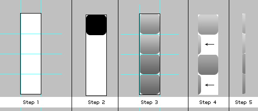
After creation of your new photoshop file you should add some layer guides. This really helps aligning the different menu items pixel perfect:
 As you can see i divided the canvas with a single horizontal line at the 40px mark, and made a guide every 200px to mark the end of each menu item. I then made a guide for the 125px normal state as well. These Guides are not needed but very helpful ;)
 Now create a new layer, select black (this is important for later) as foreground color and draw a rectangle which fills the upper half of your file. Then double click the layer in the Layers palette to open the layer styles, select Gradient and apply a gradient with the foreground color #959595 and #d0d0d0 as your background color. The result should look similar to the the picture above. Opacity should be 100%.
 Now we are adding the inset text: Select the Type tool and set the font to Myriad Pro Regular and #444444 as color. Open the layer styles for this layer and select the Drop Shadow option, then apply the following settings:
- Blend Mode: Normal
- Color: #FFFFFF (white)
- Opacity: 50%
- Use global light: off
- Angle:90°
- Distance:1
- Spread: 0
- Size:0

To center the text pixel perfect horizontally as well as vertically select the marquee tool and draw a rectangle. Thanks to the layer guides the rectangle will snap into position and have the exact same height and width for each item. Then select the move tool and hit the align buttons for align vertically and horizontally. Repeat this for each menu item.
 Next we will add the icons for the hover effect. I used the famous “Bright” Icon set by Min Tran. These icons should be applied between the 125px and 200px guide. After doing that create a new folder in the layer palette and put all layers created until now into this folder.
 Now duplicate this folder. Select it with the Move tool and drag it 40pixel down. The horizontal guide should help you putting it into the right place. After doing that go to the layer style palette for this layer and set the opacity of the gradient to 80%. Last thing to do is to change the color of the Text to #FFFFFF and edit the Text layer styles:
Set the drop shadow to -90° and the color to #000000. The image above shows you how your image should look now.
 To add the borders between the menu points select the line drawing tool and set the foreground color to #969696. Select the pixel mode and remove the checkmark from anti alias. This is needed to draw a exact line of 1px without any blur. After drawing this line from top to bottom of the image go to the layer style palette again and add a border of 1px, color: #b8b8b8, position outside and set the Blend Mode to Lighten.
After doing that align the borders directly beside the layer guides as seen in the picture.
What we got now should look something like this:
Now export this image as kwicks_sprite.jpg. Don’t slice anything, just export the picture ;)
Part 3: HTML and CSS
The HTML part is rather easy: all we need is an unordered list with classname kwicks. Each list item must have an id which is composed of kwick + the number of the item.
 <ul class="kwicks">
     <li id="kwick1"><a href="#">Home</a></li>
     <li id="kwick2"><a href="#">Contact</a></li>
     <li id="kwick3"><a href="#">Downloads</a></li>
     <li id="kwick4"><a href="#">Search</a></li>
 </ul>
Thats it for the HTML part, now comes the CSS:
 .kwicks {
     list-style-type: none;
     list-style-position:outside;
     position: relative;
     margin: 0;
     padding: 0;
 }
This is needed to remove margins and paddings from the menu, as well as the list bullets.
 .kwicks li{
    display: block;
    overflow: hidden;
    padding: 0;
    cursor: pointer;
    float: left;
    width: 125px;
    height: 40px;
    margin-right: 0px;
    background-image:url(kwicks_sprite.jpg);
    background-repeat:no-repeat;
}
Major styling done for the list item here. Height and width are set and our image is set as background for each list item. Since we don’t want to display the normal list Text we set the text indent for all links to:-9999px:
.kwicks a{
	display:block;
	height:40px;
	text-indent:-9999px;
	outline:none;
}
What we got now looks pretty good: HTML- Step 1
Now we want to display the appropriate menu point so we have to change the offset of the background image with css for each list item:
#kwick1 {
	background-position:0px 0px;
}
#kwick2 {
	background-position:-200px 0px;
}
#kwick3 {
	background-position:-400px 0px;
}
#kwick4 {
	background-position:-600px 0px;
}
And voila, looks like a real menu: HTML- Step2
Next thing we do is adding the roll over state:
#kwick1.active, #kwick1:hover {
	background-position: 0 bottom;
}
#kwick2.active, #kwick2:hover{
	background-position: -200px bottom;
}
#kwick3.active, #kwick3:hover {
	background-position: -400px bottom;
}
#kwick4.active, #kwick4:hover {
	background-position: -600px bottom;
}
The pseudo class “:hover” is added to the list item and not to the <a> tag. Since Internet Explorer 6 can only work with this pseudo class when applied to an <a> tag we define an extra active class which accomplishes the same. This class will be automatically added by the jQuery script on hovering. You might ask yourself why I didn’t style the <a> tag with the background image to circumvent this problem. I do this because of the round corners which I will apply later on. I could have done it anyway with a little bit of extra HTML markup but I want to keep the HTML as clean as possible. It’s truly only a matter of preference. If you intend to create a menu without round corners you can apply the background images, as well as the offsets directly to the <a> tag.
So if you are using a browser other than IE6 you can see a basic CSS sprite menu with different hover states now: HTML- Step3
Thats it for the CSS part, we will add the round corners add the end of the tutorial since its something not everyone will be interessted in and demands a little bit of extra work.
Part 4: jQuery
To add the sliding effect we need to add the wonderful kwicks plugin for jQuery created by Jeremy Martin. Of course you need to import the jQuery framework as well.
Your HTML head should look something like this:
<link rel="stylesheet" href="style.css" type="text/css" media="screen" />
<script type='text/javascript' src='jquery-1.2.6.min.js'></script>
<script type='text/javascript' src='kwicks.js'></script>
<script type='text/javascript' src='custom.js'></script>
Be careful with the order of the items. Due to the fact that the kwicks plugin relies on some of the CSS classes we defined you must include the CSS before the kwicks.js file. The custom.js file is a blank Javascript file which you should create, we will now add the code of execution to this file:
 function my_kwicks(){
    $('.kwicks').kwicks({
        duration: 300,
        max: 200,
        spacing:  0
    });
}

 $(document).ready(function(){
	my_kwicks();
});
The code is rather easy to understand: the function my_kwicks calls the execution of the plugin with several parameters:
- duration of the sliding effect in milliseconds
- max width of each kwicks item in pixel
- spacing between the items in pixel
You can define many more parameters, a comprehensive list can be found at the plugin page at the documentation tab.
The ready function executes the code as soon as the site (in particular the DOM) is loaded. Thats it for the jQuery magic as well: here we got the working example
Congratulations, you are done now ;)
Part 5: Voluntary Exercise – Rounded corners
The rounded corners can be added with different techniques. Since a major part of this tutorial is dedicated to the task of CSS Images sprites we will extend this a little bit by creating a rounded corner sprite. One image for the left and right corners, along with the hover state. The easiest way creating an image sprite like this is aligning the different sprites below each other. Since we need 4 different sprites we will create an image of 160px height and a width of your choice. The width doesn’t matter since we will crop the image afterwards. ( I will use 40px width for now)
- First you should add layer guides again for pixel perfect alignment.
- Select black as your foreground color and draw a rounded rectangle (8px radius, anti alias:on).
- Copy this rectangle 4 times and apply the same layer style of the menu background, which we created in Part 2: Photoshop. The 2 bottom rectangles are for the hover state of the menu, so they need to have the same layer style as the hover state of the menu items (opacity:80%)
- Now move rectangle 2 and 4 out of the canvas until you only see the round corners.
- Crop the image so that only the round corners can be seen.
 Export the Image as end.jpg and add the following styles to your CSS file:
#kwick1 a{
	background-image:url(end.jpg);
	background-repeat:no-repeat;
	background-position: left 0px;
}

#kwick1 a:hover{
	background-position: left -80px;
}

#kwick4 a{
	background-image:url(end.jpg);
	background-repeat:no-repeat;
	background-position: right -40px;
}
#kwick4 a:hover{
	background-position: right -120px;
}
This adds the corner sprite to the first and fourth menu item and overalps the background for the list item.
Your are done now: here is the final menu
Part 6: Holy crap, too much work, I just want to download this and leave
Well, in case you couldn’t get this to work or are to lazy to create the files: here is a Zip- Package with all items: psd files, html, css and javascript:
Includes: PSD Files, HTML File, CSS File, Javscript Files
Hope you liked the tutorial and learned something, have a nice day ;)


Hi,
superb tut….
Is there any way, or simple, to make the menu captions textual rather than images? Lot’s of work for a multi-lingual website.
Thanks again.
Nice tutorial! very well explained. However in my opinion Myriad Pro Semibold (with crisp setting) matches better than Myriad pro Regular.
This is a great interactive menu! The use of sprites definitely improves performance. Good job!
this is awsome mann,thanx
Love the script dude. I’ve integrated it into my website.
Big Index – Australian Business Directory
amazing menu. great job!!
nice work,keep it commin bro
Awesome tutorial.
Now, how would you do the same thing for wordpress? That would be a good tutorial.
Thanks for this great tutorial! it’s really helpfull!
I’m having a hard time understanding how to modify this for my own site. The size in 780px wide, and one of the buttons is much larger than the other 4. Can you please help?
A*M*A*Z*I*N*G
I’ll teach this effect to my wed design students.
Thanks a lot.
A*M*A*Z*I*N*G
I’ll teach this effect to my web design students.
Thanks a lot.
this is gooooood.tnx
I’ve used it for client’s cool menu – thank you so much!!!
Thanks, Nice tutorial, useful for many people
Awesome menu! I need to have 5 items on my menu but my photoshop knowledge isn’t so good. I’ve tried to follow your instructions but no luck..can anyone help me?
Thanks
I love JQUERY and use it on most of the websites..