
-
AuthorPosts
-
June 30, 2014 at 4:12 pm #285250
Hello,
I am currently developing a one page site, and need to add text to the header (logo left, text right). The text will be a phone number which will be clickable on mobile phones, and an email which will be a mailto link.
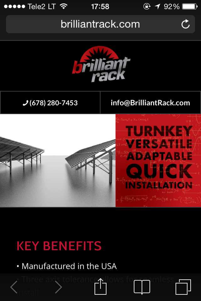
See jpg mockup here: http://i.imgur.com/M2nctTN.jpg
Any help is appreciated.
-Ryan
June 30, 2014 at 6:32 pm #285326I found another solution, but have a follow up question. I put the phone and e-mail in the main menu below the header. They are live links (and the only menu items), so I would like to hide the mobile menu and leave the main menu on all devices.
I have been unable to add the correct custom CSS. Take a look and let me know how to accomplish this.
Thanks,
RyanJune 30, 2014 at 11:27 pm #285460Hey Ryan!
Try adding this code to the Quick CSS:
.container #advanced_menu_toggle, #advanced_menu_hide {
    display: none !important;
}
.main_menu, #header_main_alternate, #avia-menu {
    display: block !important;
}
@media only screen and (max-width: 767px) {
#header_main_alternate .container{
    width: 365px;
}
#avia-menu a{
    font-size: 12px !important;
}
}
Cheers!
JosueJuly 1, 2014 at 12:31 am #285478Thanks Josue. That worked for hiding the mobile nav and showing the main nav, but the menu is now left justified, and the logo is floating left on mobile devices. Tried tweaking the CSS to align center for both, no luck. Any help is appreciated!
Ryan
July 1, 2014 at 4:35 am #285529Try changing the code to:
.container #advanced_menu_toggle, #advanced_menu_hide {
    display: none !important;
}
@media only screen and (max-width: 767px) {
.main_menu, #header_main_alternate, #avia-menu {
    display: block !important;
}
#header_main_alternate .container{
    width: 365px;
}
#avia-menu a{
    font-size: 12px !important;
}
.responsive .logo {
    float: none !important;
    margin: 0 auto !important;
    right: 0 !important;
    left: 0 !important;
    width: 104px;
}
}
Best regards,
JosueJuly 1, 2014 at 4:42 am #285533Thanks once again Josue. That does resolve the left justifying issue, but the menu drops into 2 rows (not visible over slider photo) on mobile devices (viewing on iPhone 5). I tried bumping the font-size down to 11px, and also shortened the menu titles, but neither helped. \
Let me know if this is an easy fix.
Ryan
July 1, 2014 at 4:45 am #285535Hey Ryan!
Can you post a screenshot of the view on iPhone 5?
Regards,
JosueJuly 1, 2014 at 4:47 am #285537iPhone 5 screenshot – http://i.imgur.com/pWkL9yv.png
July 1, 2014 at 5:20 am #285550Try increasing this value in the Quick CSS code:
#header_main_alternate .container{
    width: 365px;
}
Cheers!
JosueJuly 1, 2014 at 5:28 am #285557Went all the way up to 650px. Still no luck.
July 1, 2014 at 5:32 am #285558I’ll ask Yigit to check this on his iPhone as i don’t have one at hand.
Regards,
JosueJuly 1, 2014 at 2:12 pm #285714Hey!
Please try adding following code to Quick CSS
@media only screen and (max-width: 480px) {
li#menu-item-31 a {
padding: 0 7px;
font-size: 11px!important;
}}
Regards,
YigitJuly 1, 2014 at 3:51 pm #285752Thanks Yigit. Unfortunately, the menu us still dropping into two row (and left justifying) on mobile devices (viewing on iPhone 5).
Ryan
July 1, 2014 at 4:03 pm #285760Hi!
Do you mind posting a temporary admin login so we can investigate further?
Cheers!
YigitJuly 1, 2014 at 8:07 pm #285881This reply has been marked as private.July 2, 2014 at 10:57 pm #286428Hi – just following up on this issue. Let me know!
Thanks,
RyanJuly 3, 2014 at 2:57 pm #286695Hey!
I have tried many custom CSS code but menu text is so long for mobile. Would you like to try adding a phone icon instead of text “call us”?
Regards,
YigitJuly 3, 2014 at 3:30 pm #286705Thanks Yigit. A phone icon would be fine. Is there one available within the theme?
July 3, 2014 at 3:43 pm #286707Hey!
Yes you can use following code in Appearance > Menus
<span class="av-icon-char" aria-hidden="true" data-av_icon="" data-av_iconfont="entypo-fontello"></span>You can add it in front or after your phone number
Regards,
YigitJuly 3, 2014 at 4:46 pm #286734I tried this, but unfortunately, it’s still dropping the phone # into a second row, and also left justifying on mobile. See screenshot. http://i.imgur.com/1A1B7S6.png
July 3, 2014 at 4:59 pm #286741Hey!
Can you try it now? I have made some adjustments and now it does look like this on my iphone 4 – http://i.imgur.com/spijdJe.png
Regards,
YigitJuly 3, 2014 at 5:25 pm #286749That works! Thanks. The only issue is the it is still left justifying below 768px when I resize my browser (looks fine on iPhone, but won’t look right on small browser or tablet). See screenshot.

I really appreciate all the help on this!
Ryan
July 3, 2014 at 7:17 pm #286820Hey Ryan!
Test it now, i modified something in the Quick CSS.
Cheers!
JosueJuly 3, 2014 at 7:54 pm #286841Looks great. Thanks!!
-
AuthorPosts

- The topic ‘Adding clickable text to the header area’ is closed to new replies.