Viewing 7 posts - 1 through 7 (of 7 total)
  • Author
    Posts
  • #479747

    Hi,

    On the page (URL included in this post) I have two tables. They are both scrollable on mobile devices. But when viewed on a mobile device (lower than 768px width) the width of the columns in the first table is different from the columns in the second table. How can I make the columns in the second table as wide as the columns in the first table?

    #479894

    Hi mrijnders!

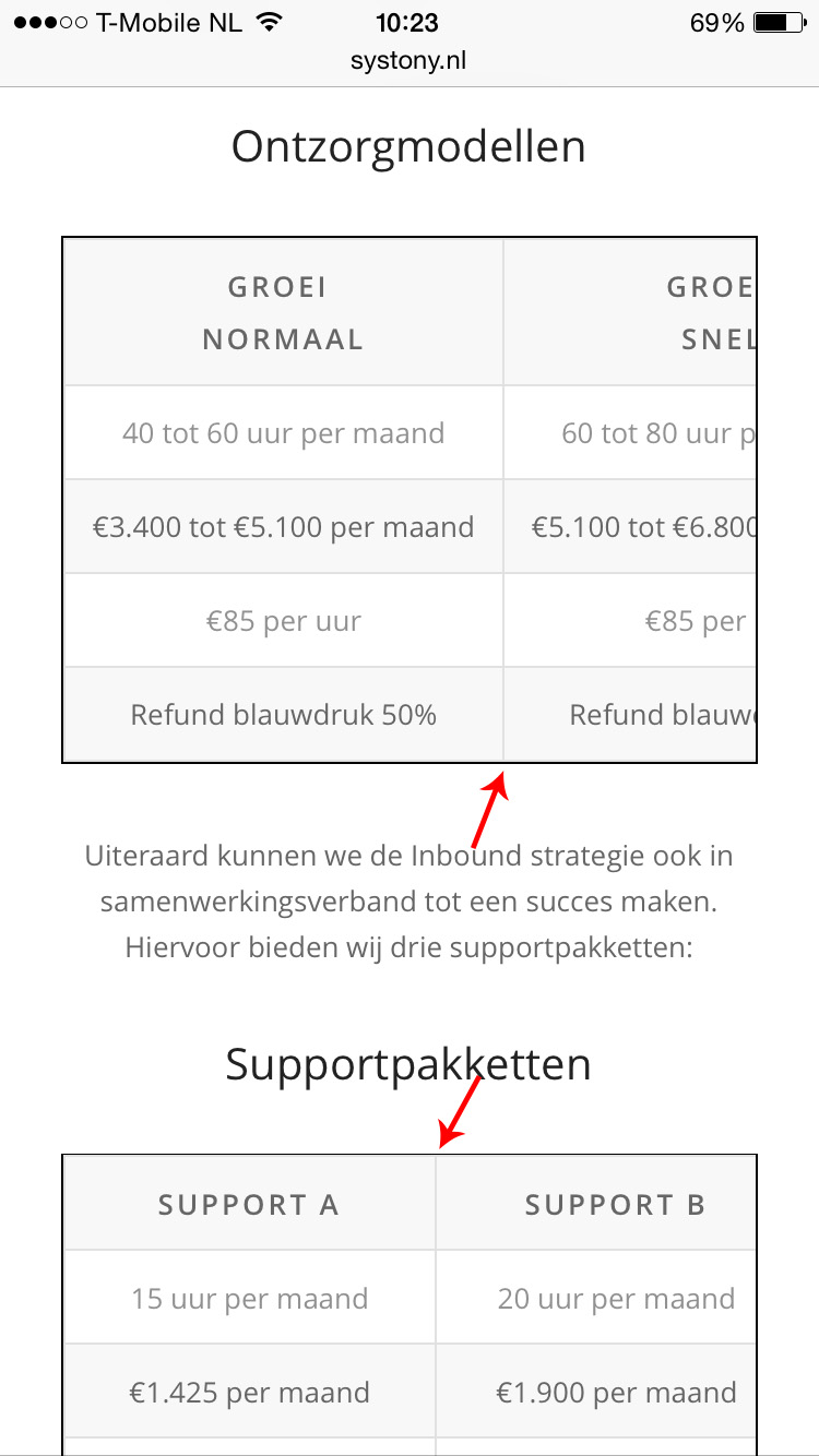
    It appears that the headings for the first table are not breaking (going to the next line) at a certain width.

    On the other hand, the second tables content and headings are not long enough to cause the scroll width of the first.

    May we have temporary access to your website so we can take a closer look?

    Regards,
    Dake

    #480569
    #480774

    Hey!

    Please try adding a line break between each heading for the first table like the screenshot below:

    http://i.imgur.com/JlOTLXY.png

    Cheers!
    Dake

    #481227

    Hi

    That didn’t work.

    I want the column of Support A as wide as the column of Groei Normaal. On a desktop they are as wide, but not on mobile screens.

    #482116

    Hi!

    Did you get this sorted? They are displaying the same widths for me.

    Regards,
    Elliott

    #482128

    Hey!

    try this code:

    @media only screen and (max-device-width: 736px) {
    center {
    width: 143px; 
    }}
    

    and adjust as needed.

    Regards,
    Andy

Viewing 7 posts - 1 through 7 (of 7 total)
  • You must be logged in to reply to this topic.