
-
AuthorPosts
-
November 7, 2016 at 7:52 pm #709447
I have used fixed background images in Color Sections throughout the client’s site. I noticed that these images are not responsive, so tried to choose photos where the center section was meaningful and would look OK. However the client would like these images to be responsive like the Home page slider is. Is this possible to do? I do not see a control to make this happen.
November 8, 2016 at 1:11 am #709577Talking further with the client, it appears that the real problem is that the images are scrolling with the frame on mobile devices, rather than being fixed in position on the screen with the frame scrolling past the image. The images are frozen in position within the frame and are cropped oddly. Look at the site on a smartphone and you will see what I mean.
If the fixed/scrolling issue can be resolved, the images will be fine – don’t need to be responsive.
November 9, 2016 at 8:01 pm #710422Hi,
use this code as an example to control your images on mobile:
@media only screen and (max-width: 767px) {
#who {
background-size: 277% 85% !important;
background-position: -337px 85px !important;
}}
Best regards,
AndyNovember 9, 2016 at 9:24 pm #710447Thank you.
To be clear, we are no longer trying to create the parallax effect on mobile – I understand that is not possible. We are now only trying to control the cropping – the section of the photo that appears on mobile devices. As it stands, the desktop view selects from the TOP of the image, while the mobile view selects from the BOTTOM of the image. We are trying to get the mobile view to select from the TOP of the image – that would fix the problem.
My developer tried the code you sent. What happens is that the code is effective when the site is viewed in a browser on a computer that is simulating a mobile (for example, on Chrome); however, when the site is viewed on a mobile device, there is no effect.
Below, I will paste the contents of the custom.css file so that you can see we are applying these commands correctly. You can view the results for yourself by visiting the page: http://www.abeautifulceremonynw.com/newsite/faq/ and looking at the image at the top first in a browser in a mobile simulating view (where the screen size is small to trigger the css), and then again on an actual mobile device (We are testing on an iphone 5s and Nexus 5 and 6.
****************contents of custom.css below*****************************

/* Have fun adding your style here :) - PS: At all times this file should contain a comment or a rule, otherwise opera might act buggy :( */

/* General Custom CSS */

/*
Desktop Styles

================================================== */

/* Note: Add new css to the media query below that you want to only effect the desktop view of your site */

@media only screen and (min-width: 768px) {

  /* Add your Desktop Styles here */

}

/*

Mobile Styles

================================================== */

/* Note: Add new css to the media query below that you want to only effect the Mobile and Tablet Portrait view */

@media only screen and (max-width: 767px) {

  /* Add your Mobile Styles here */

.responsive #top #main .container_wrap:first-child {

background-size: 277% 85% !important;

background-position: -337px 85px !important;

}

}
November 11, 2016 at 1:06 am #710943I hope you have a solution to the above. The real issue appears to be that on mobile, with this particular theme for some reason unknown to us, the parallax images are not obeying the commands we’re giving them as to where to position themselves within the frames. The commands work on a normal browser made to simulate a mobile, but not on an actual mobile. Hopefully, you will be able to figure out why. Thanks in advance.
-
This reply was modified 7 years, 5 months ago by
jeffersonh.
November 11, 2016 at 4:23 pm #711230Hi,
is no code (using media queries) applying fine on mobile for you? make sure to clear browser cache and refresh a few times. Also check on another mobile device.
Best regards,
AndyNovember 11, 2016 at 6:40 pm #711319Andy, I don’t know how much clearer I can be. We have checked on multiple mobile devices. To repeat, the parallax images are not obeying the commands we’re giving them as to where to position themselves within the frames. The commands work on a normal browser made to simulate a mobile, but have no effect on an actual mobile device.
Did you try this out yourself? Did you view the site on a mobile device?
Your theme is an excellent one and overall, the client is very happy with the look and functionality of it, however this one glitch is a serious problem.
Thanks for your attention.
November 14, 2016 at 7:18 am #711803Hey!
Please target the actual device with the following css codes.
iPhone 5s
@media only screen
and (min-device-width : 320px)
and (max-device-width : 568px) {
    .responsive #top #main #av_section_1 {
        background-size: 450% 100% !important;
        background-position: center center !important;
    }
}
Nexus 5 and 6:
@media only screen
and (min-width: 360px)
and (orientation: portrait)
and (-webkit-min-device-pixel-ratio: 3.0) {
  * {
    .responsive #top #main #av_section_1 {
        background-size: 450% 100% !important;
        background-position: center center !important;
    }
  }
}
If you want to replace the generic selector “#av_section_1” with your own custom selector, apply a unique Section ID to the color section. Don’t forget to remove browser cache or hard refresh before checking the page.
For more css media queries, please check the following link:
// http://stephen.io/mediaqueries/
Best regards,
IsmaelNovember 15, 2016 at 12:10 am #712223Did you attempt to duplicate the problem by viewing our site on a mobile phone?
For that matter, have you viewed YOUR OWN Enfold Wedding Demo site on an actual mobile device? It has the same problem. Picture cuts off the woman’s head.
We don’t need a lesson in how to do media queries, we need, hopefully, some answers as to WHY media queries on this theme DO NOT WORK on ACTUAL mobile devices.
As I say, YOUR OWN DEMO SITE has this problem. Check it out yourself on an actual mobile phone.
November 15, 2016 at 10:00 pm #712629Hi,
it seems you don’t get what responsiveness means. It does not mean that any theme in the world can know how you want your image to be displayed on different devices. Instead it means that you’re able to control it’s behavior on different screen sizes. So use the function of media queries, which Enfold is able to use, to do exactly that.
Let us know in a new ticket if you have some questions/issues directly related to our theme and we’re happy to support you.
Best regards,
AndyNovember 15, 2016 at 10:28 pm #712643well if you look here http://webers-testseite.de/ikom/circles/
on top there is a responsive background-image in a color section. !The thing is how to set up that color-section.
Choose “no minimum height and on tab 2 choose “scale to fit”. (this is not so important because image-background size will be calculated later – but you will have to know the class for the color section)Than you have to know the aspect-ratio of your background image !
f.e. your background image has a 4:1 ratio. (1200px : 300px)
on quick css i than set up the height from the color-section by:.page-id-2981 .avia-full-contain { background-size: 100vw auto; height: calc(25vw); }that is the trick ! the css width is set to 100vw and height to auto
the height of the container is in dependency to image aspect ratio. !but never the less you will than have to think about the content in it ( f.e. h2 headings on my example)
and than we are again on media querries to adapt it to shrinking color sectionsNovember 15, 2016 at 10:31 pm #712645by the way on very small screens you have to think about the min-height option of 100px.
So you have to get rid of that too if the height of the shrinking header will get less than 100px.the rule from enfold:
.avia-section {
    clear: both;
    float: left;
    min-height: 100px;
    position: static;
    width: 100%;
}
November 15, 2016 at 10:36 pm #712648It seems you don’t get what “media queries on this theme DO NOT WORK on ACTUAL mobile devices” means. Nor are you looking at your own theme demos on actual mobile devices. We installed and used the custom media queries you provided. They work in simulations but not on actual mobile devices. Try it yourself. Test it yourself. For the sake of your theme.
No reply needed.
November 15, 2016 at 11:01 pm #712654please go and look again.
I tested something for you .
it seems to work on my old iphone 4s – so i could not believe that it won’t work on actual mobile phones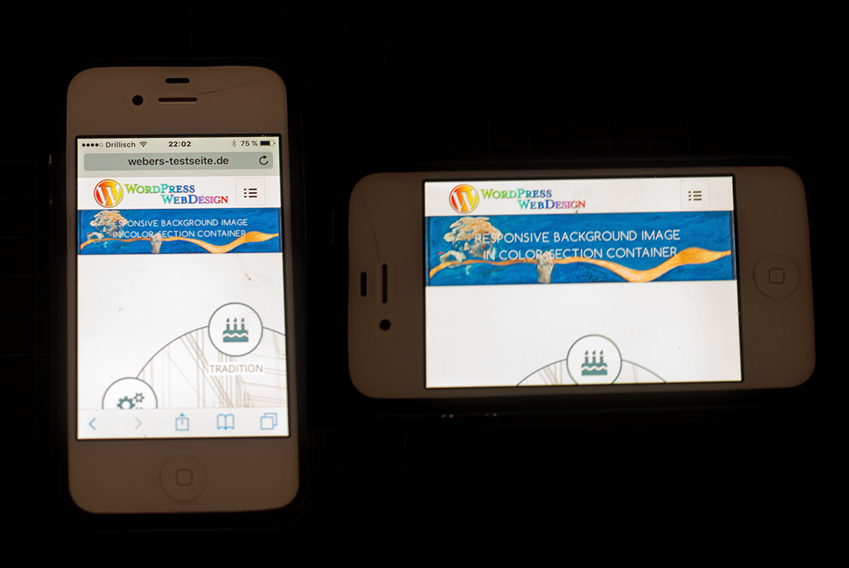 November 15, 2016 at 11:10 pm #712655
so – did you realy read what i wrote – that is the question !
November 16, 2016 at 12:04 am #712672@Guenni007 – Thanks so much for attempting to help.
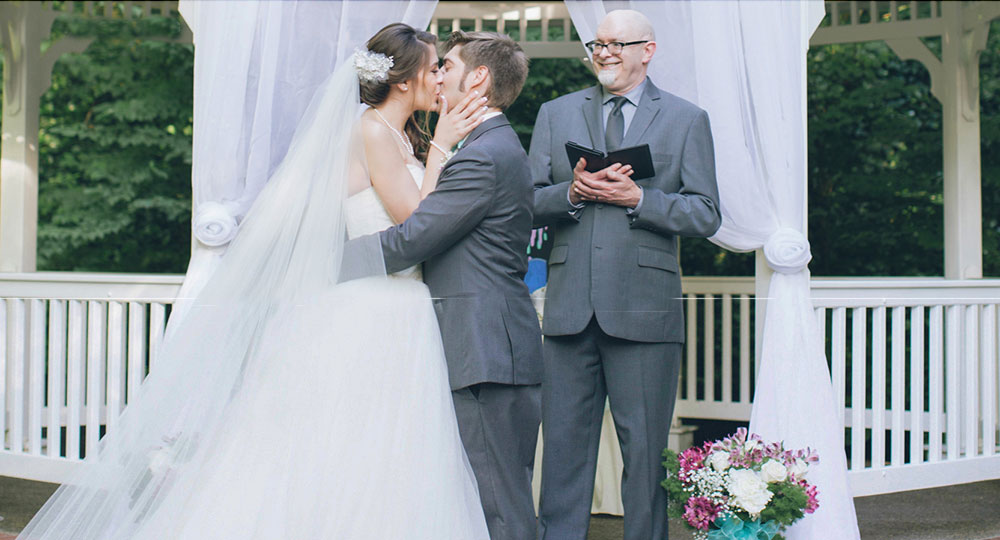
Here is what we are trying to resolve. If you look at the Enfold-Wedding Demo: http://kriesi.at/themes/enfold-wedding/ on a mobile device (not on a simulated mobile device on a desktop, but on an actual mobile device), you will see that the photo of the girl cuts off the head:
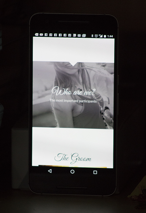
This is exactly what is happening with all of our photos contained in “Color Sections” – they crop off the top. I have written to the theme people, above, and they have offered various media queries. My own programmer, who is very good and very resourceful, has also implemented various media queries. They work fine on a simulated mobile device on a desktop, but do not work on an actual mobile device. We have tested many different media queries, both from the Enfold authors and from my own programmer and they do not work on actual mobile devices.
We believe there is something in the Enfold theme which is blocking these media queries from working on mobile devices. We have no idea what. The theme authors have been no help. If you can offer any suggestion that would be greatly appreciated.
November 16, 2016 at 2:31 am #712691Specifically, on the “Color Sections,” the theme positions the background images “center bottom” instead of “center top” on all mobile devices, and ignores CSS commands to position the background differently.
November 16, 2016 at 9:21 am #712798but this is not a matter of responsiveness it is a trouble with fixed positioning. And that seems to be a global Problem of all Mobile Browsers.
https://coderwall.com/p/kivwgg/position-fixed-on-mobile
maybe there are some javascript solutions http://bradfrost.com/blog/mobile/fixed-position/#js-solutions but definitly there is no one and only good fix of that.
-
This reply was modified 7 years, 5 months ago by
Guenni007.
November 16, 2016 at 10:04 am #712816if you have a shrinking header there is an old thread of mine because sometimes it is not so important that the scroll-offset is missing.
But sometimes it is.https://kriesi.at/support/topic/color-section-on-top-fixed-background-attachment-positioning/
and a not so perfect solution for desktop browsers. This is a problem with header and shrinking header height. The scroll offset seems to be not considered of the positioning.
see here the fix (for desktop browsers – not for mobile): http://webers-testseite.de/kaetz/leistungen/
edit : look to the page above with your mobile ! i placed that “bride” image near the bottom.
and if you look to it in landscape mode you see that the image is cropped at the bottom !-
This reply was modified 7 years, 5 months ago by
November 16, 2016 at 11:51 am #712852and once again: if you have a non shrinking header – you know your header hight ! from Enfold Dialog
if you choose small i guess it is 50px – for big …. look yourself. this comes to scroll-offset on main!so if you have a color section with fixed positioning add a custom class – maybe topfixed or something like this:
.responsive #top .avia-section.topfixed {
    background-position: center 50px !important;
}
or left or right. etc. the 50px (look to the bride theme) on css you find the background-position : center top but without regarding the header hight.
on responsive case the sticky header is lost – and scrolls away – so background position has to get the top (0px value) !!!
@media only screen and (max-width: 768px) { .responsive #top .avia-section.topfixed { background-position: center 0 !important; } }-
This reply was modified 7 years, 5 months ago by
November 16, 2016 at 7:27 pm #713150This is from my developer:
Thanks for all of your help and suggestions in getting this resolved. I appreciate all of the ideas, but I think the problem is different. You have acknowledged that there is a difference in mobile vs. mobile simulated on browser, and you have suggested that this is due to bugs with fixed positioning in mobile and/or that we are simply not applying the right CSS commands. Based on my testing, I suggest an different theory: the theme is using javascript to detect mobile browsers and is then adding classes or styles which are overriding our custom CSS. I suspect the javascript is setting background size and position to make sure that no matter what image has been uploaded, the area at the top is filled. This is a reasonable theory, considering the theme author had to account for a wide range of input from users. Maybe this is due to a setting that has been chosen in the theme settings. If you can think of any setting that may be affecting us, that would be helpful.
To support my theory, I’ve created a test page where I’ve extracted the pertinent HTML/CSS for the top banner region. I’ve added the same mobile-targeted media query that I’ve added to the site. My test page looks the same in desktop when I simulate a mobile device as it does in an actual mobile device. I did this only to show that this is not a CSS or mobile-browser bug issue: http://www.abeautifulceremonynw.com/newsite/main-mobile.html
So, what we are hoping to gain from you is knowledge or ideas about what the theme may be doing in response to detecting a mobile/tablet browser. We need your help to find this because it won’t show up in our desktop browser and so we can’t use developer tools to find it. Also, I don’t want to have to sift through all the site’s javascript J Ideas? If I know what it is doing, I can override it!
November 16, 2016 at 8:41 pm #713187is your header a shrinking one or not ?
is it fixed on top ?The thing i understand from your request is that you don’t want to crop the images on top.
The responsive behaviour is a different thing – but you see on screenshot here: https://kriesi.at/support/topic/is-there-any-way-to-make-the-background-image-in-a-color-section-responsive/#post-712654 that it will work on real mobile browsers too and even the font goes to the responsiveness.On what mobilephone your are testing these pages – tell me your Browser and or IOS version please.
you can see here : http://webers-testseite.de/kaetz/leistungen/#av_section_6
ist this what you want? it is positioned center top even if you are turning your mobile to landscape the hat of that young lady isn’t cropped.
no mobile simulated – i can see it on my iphone 4s ( a bit older) and on my ipad4 that all is working in that manner you prefer.Do you can see it too on my testpages that it works? ( i only have here mac equipement – so i could not test it in other variants.)
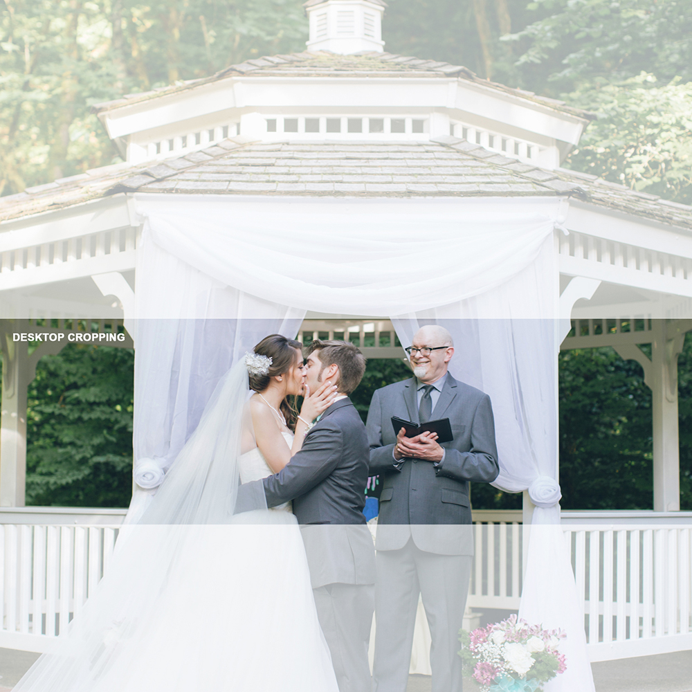
November 17, 2016 at 3:06 am #713331OK, I figured out a workaround for anyone having the same problem. It uses the image only, no coding needed.
Use a square image. I used about 1700px X 1700px. Keep the subject matter in the bottom half of the frame.
Upload it as the section background. Set to “Fixed,” set the image position to “Bottom Center,” and the Background Repeat to “Stretch to Fit.”
This gives you the following croppings on desktop and mobile:
Desktop:
Mobile:
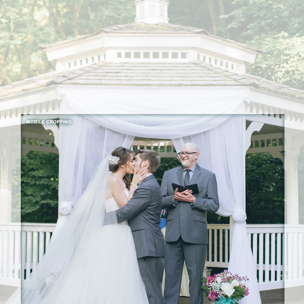
Hope this helps. Doesn’t matter what’s in the top part of the image – it isn’t seen.
November 17, 2016 at 7:05 am #713386Hi,
That’s a nice workaround and it should work for most images. Thanks for sharing. :)
Best regards,
IsmaelNovember 17, 2016 at 9:20 am #713451and i thought that an image like this is your problem:
and look what my solution did with it in mobile (not simulated mobile) does with it!
http://webers-testseite.de/kaetz/leistungen/#av_section_6 November 18, 2016 at 1:22 pm #713971
@Guenni007
Thanks as always for sharing your solutions with us.Best regards,
Andy -
This reply was modified 7 years, 5 months ago by
-
AuthorPosts
- You must be logged in to reply to this topic.