
-
AuthorPosts
-
May 13, 2015 at 7:05 pm #443960
Hello Support,
On this site, stellarskulls.com, the logo (two red skulls with text inbetween) is off screen to the right on an iPad with Safari.
You can see a screenshot here: screen shot link.
Can you advise me how to fix this?
Also – any suggestions on how to keep the nav from “wrapping” to a new line with the end element?
Thank you,
GregMay 14, 2015 at 10:24 am #444185Hey Greg!
It looks the same on the desktop version of Safari, please try this in Quick CSS under Enfold–>General Styling:
.logo img {
  left: 0% !important;
  transform: translate(0%) !important;
}
Cheers!
RikardMay 14, 2015 at 11:36 pm #444660Hello Rikard,
I placed the code in the Quick CSS. It still is off screen.
Also, I was told in another support communication to place the following in our CSS:
.logo { width: 100% !important; }
.logo img { left: 50% !important; transform: translate(-50%) !important; }
Might the two now be conflicting?
~ GregMay 15, 2015 at 9:31 am #444838Hey!
Yes they most likely will, could try to remove the code you did not get from me to see if it helps? If it does not, then please provide us with a temporary admin login so that we can take a closer look. You can post the details here as a private reply.
Regards,
RikardMay 21, 2015 at 3:34 am #447520Hello Rikard,
I finally got back to this.
It centered the logo, but it is smaller then it should be.
iPad/Safari screenshot
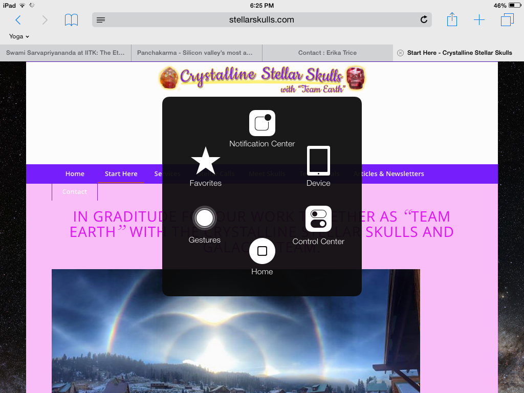
Firefox screen shot

Thoughts on getting it “full size”?
TIA,
GregMay 21, 2015 at 3:35 am #447523PS. The black element in the center of the iPad shot is because my wife’s home button broke. That is an app as a “fix”. gw
May 22, 2015 at 5:29 am #448154Hi!
Please add the following as well:
.html_header_top.html_logo_center .logo {
  left: 0% !important;
  -webkit-transform: translate(0%, 0) !important;
  -ms-transform: translate(0%, 0) !important;
  transform: translate(0%, 0) !important;
}
Regards,
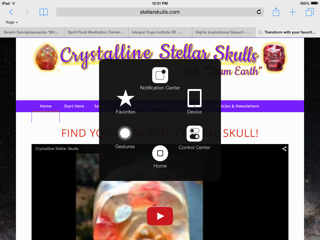
RikardMay 26, 2015 at 9:18 pm #450322Hello Rikard,
That has helped a lot – thank you.
There are two items I’d like to fix if possible:- Less white space between logo and menu with iPad/Safari
- Fix so entire menu is on one line – right now, menu wraps with iPads/Safari
Any advice? (screenshots below)
~ GregiPad/Safari Screen Shot
Firefox Screenshot

-
This reply was modified 8 years, 11 months ago by
Donkies11.
May 28, 2015 at 5:18 am #450879Hi!
Please try the following in Quick CSS:
@media only screen and (min-width: 768px) and (max-width: 1024px) {
#top .av_seperator_big_border#header .av-main-nav > li > a {
  padding: 0 1px !important;
}
}
Regards,
RikardMay 28, 2015 at 11:23 pm #451471Hello Rikard,
I think we’re well into the ballpark now – and you’ve put a lot of time/energy into this one, which is greatly appreciated.
I say we call this one closed.
Thank you,
GregMay 30, 2015 at 5:30 am #451876 -
AuthorPosts
- The topic ‘Logo off screen on iPad/Safari’ is closed to new replies.