
Tagged: mobile, responsive, sticky header
-
AuthorPosts
-
March 30, 2015 at 8:20 pm #420774
Hi, I have disabled the responsive option because I think the page looks better this way on mobile devices.
I mentioned a strange behavior:
If the sticky header option is activated and I zoom on any page with my mobile (Galaxy s5) the menu
seem to adapt to the screen and is overlapping the whole content. When I disable the sticky header everything is fine.I want to use the sticky header, is there any trick that the menu stay where it should be?
http://www.haustechnikbedarf.chthanks
SiracherApril 1, 2015 at 12:30 pm #421842Hey Siracher!
Thank you for using Enfold.
Can you please provide a screenshot of the issue? Please use browsers like Chrome or Firefox instead of the default android browsers. I’ll ask the rest of the support team to check it.
Regards,
IsmaelApril 6, 2015 at 9:53 pm #424276Hey!
It seems to be working fine on the Moto E and Nexus 7. Can you take a screenshot of what your seeing?
Cheers!
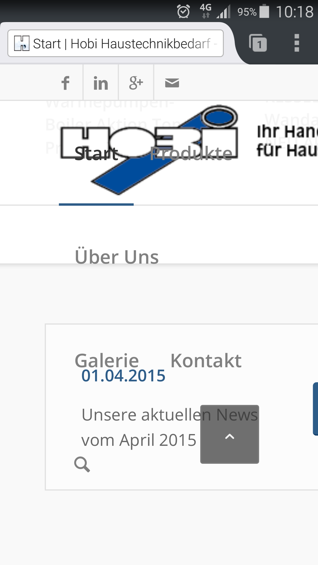
ElliottApril 7, 2015 at 10:28 am #424547Hi Isamel and Eliott
thanks for your feedback. Attached is a screenshot of the menu how it looks like on my Galaxy S5 zoomed in.
I forgot to mention that the I am using Firefox as mobile browser!I just checked it with the standard chrome browser and there it looks fine.
Most likely a 3rd party issue, but maybee you see a fix for it in a future release?
thanks!
here’s the screenshot of the menu using firefox mobile browser
 April 7, 2015 at 6:30 pm #424869
Hi!
I see what you mean. Does this CSS help?
@media screen and (max-width:600px) {
.avia-mozilla #header { position: absolute !important; }
.avia-mozilla #header .container { height: 88px !important; line-height: 88px !important; }
}
Your using Enfold 3.0.8 right now. Try updating to the latest, 3.1.4. It should be an easy fix for our devs so if it’s not fixed in 3.1.4 then we’ll probably get something worked out in the next update.
Regards,
Elliott-
This reply was modified 9 years ago by
Elliott.
April 8, 2015 at 3:40 pm #425369Hi Elliott
thanks for the tips. I first updated to the current enfold version and it’s still the same.
Then I entered your CSS, opened a private tab to be sure, but the menu still overlap on zoom.
regards
April 8, 2015 at 8:33 pm #425569Hey!
Well it’s in our bug queue so if our devs find a workaround then we’ll see it get added in the next update. For now though it would be best to use the official Chrome browser.
Best regards,
ElliottApril 9, 2015 at 7:46 am #425728ok great! thanks a lot
-
This reply was modified 9 years ago by
-
AuthorPosts
- The topic ‘Menu Zoom on mobile with sticky header’ is closed to new replies.