
-
AuthorPosts
-
September 16, 2016 at 11:17 am #687388
Hi
If I have an image inside a 1/2 section, when you look at it on mobile there is a border on each side rather than the image going all the way to the edge. I am assuming (from trying a few things) the border is on the section not on the image.Can you give me the css to remove the border or padding from the section if mobile view please, or to remove the padding from image if that is the case.
Thanks
Karen
September 19, 2016 at 7:27 pm #688705Hey kwebdesi,
I checked your page on mobile but could not see borders. Have you figured out how to remove them already?
If not, can you please post a screenshot and show the borders you would like to remove?Best regards,
YigitSeptember 19, 2016 at 11:13 pm #688854Hi Yigit
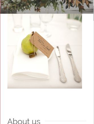
Thanks for the reply. It’s not a border as such (sorry if I didn’t explain well). Any single image has white space on the left and right – doesn’t go all the way to the edge of the screen like the slider and the masonry gallery does. Image shows the white space to left and right of the image of the pear on the table.
Whereas masonry gallery goes all the way to the edge
Thanks
-
This reply was modified 7 years, 7 months ago by
kwebdesi.
September 20, 2016 at 1:16 pm #689151Hi,
Please enable the custom css class field: http://kriesi.at/documentation/enfold/turn-on-custom-css-field-for-all-alb-elements/ and then edit your cell and give it a custom CSS class and then add following code to Quick CSS in Enfold theme options under General Styling tab
@media only screen and (max-width: 480px) {
.flex_cell.custom-cell {
    padding-left: 0!important;
    padding-right: 0!important;
}}
Best regards,
YigitSeptember 20, 2016 at 11:22 pm #689570Hi Yigit
Can’t get it to work. I have the custom field set up. I have the css in the child style sheet. I made mine .flex-cell.flocked-custom-cell
The name that goes in the custom field. Can you confirm which one I put inflex-cell.flocked-custom-cell
flocked-custom-cell
flex-cellConfirming no dot at the start when I add to field in the element..
I have tried all combinations above and tried adding to the layout image and to the actual image and can’t get a change.
Also tried making the custom CSS display:none; to see if was the padding css that wasn’t working but image still displays in mobile so it doesn’t seem to be picking up the custom CSS.
Karen
-
This reply was modified 7 years, 7 months ago by
September 23, 2016 at 1:49 pm #690715Hi,
Do you mind creating a temporary admin login and posting it here privately so we can look into it? It seems like there is an error in your custom CSS that is why it is not working.
Best regards,
YigitSeptember 23, 2016 at 1:53 pm #690719Thank you
September 23, 2016 at 1:56 pm #690722I did take the CSS out when I couldn’t get it to work
September 23, 2016 at 2:07 pm #690727Hey!
There was a small error in your custom CSS. I fixed it. Please refer to this post – http://kriesi.at/documentation/enfold/hide-menu-itemselements-on-mobile/ and display different element on mobile. You can display a fullwidth section by referring to this post – http://kriesi.at/documentation/enfold/color-section-with-100-container/
Please do not forget to flush cache on the plugin you are using after applying the changes.
Best regards,
YigitSeptember 24, 2016 at 1:59 am #691061Hi Yigit
I am confused. The original CSS you gave me wasn’t in the styling sheet – I took it out when I couldn’t get it to work. So I am not sure what the mistake was in the styling that you fixed?
This is what you gave me-
@media only screen and (max-width: 480px) {
.flex_cell.custom-cell {
padding-left: 0!important;
padding-right: 0!important;
}} – this isn’t there anywhere? There is no change – the padding is still there on the mobile.So I started trying the other option you sent through with the aim of hiding the image on the mobile but the having a colour section with the full width image which only shows on mobile. This is not the preferred option as it means I have to put every image in twice.
But I have started with that option to hide the image on the mobile version. I have added CSS
@media only screen and (max-width: 500px) {
#only-desktop { display: none !important; }
}I have added the custom class ‘only-desktop’ to the section that holds the pear image on the front page. I have cleared the cache and minified CSS . Image still there. I tried .only-desktop instead of #only-desktop. no change.
I cannot get the custom class option on the sections to work at all.
I would prefer to go back to the first option of removing the padding. Can you look at that for me please?
Appreciate your help.
KarenSeptember 26, 2016 at 5:59 am #691467Hi
Got classes working. Having another look at borders. WIll get back to you if need more assistance. Thanks
September 26, 2016 at 10:50 am #691531Hi
I am still having trouble with mobile view. I have removed the left and right padding and left and right margin from .container which has made the desktop view nicer as the section images go right to the edge but the mobile now shows the images hard against the left (which is good) but white space to the right.
I can’t work out how to get the images to have no white space on the mobile version?
Any help would be appreciated
Karen
September 28, 2016 at 1:38 pm #692610Hi,
try this code for mobile:
@media only screen and (max-width: 767px) {
img.avia_image {
width: 118%;
max-width: 118%;
left: -28px;
}}
and adjust if needed.
Best regards,
AndySeptember 28, 2016 at 2:01 pm #692646Hi Andy
Fantastic – worked! Had to use in conjunction with below and adjusted the percentages
.container {
padding-left: 0!important;
padding-right: 0!important;
margin-left: 0!important;
margin-right: 0!important;
}Looks good.
Thanks again.
September 30, 2016 at 1:12 pm #693685Hi,
glad we could help. Let us know in a new ticket if you have some more questions related to the theme. We are happy to assist you.
Best regards,
Andy -
This reply was modified 7 years, 7 months ago by
-
AuthorPosts
- The topic ‘Removing border on section in mobile’ is closed to new replies.