
-
AuthorPosts
-
July 15, 2015 at 4:50 am #473507
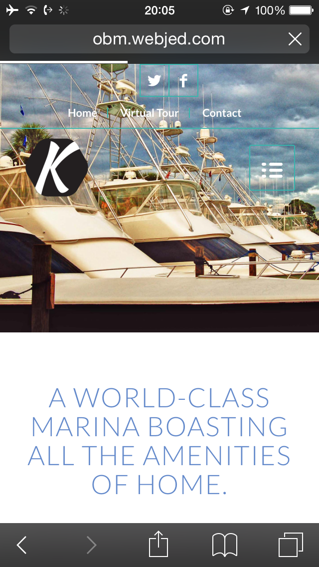
I am trying to figure out why the logo shrinks much smaller in responsive mode. Here is the example http://obm.webjed.com/tenant-amenities/
When i looked at your demo, i noticed that in responsive mode the demo logo doesnt shrink like here; http://kriesi.at/themedemo/?theme=enfold-overviewAnother issue (in Norrnal view) is the page title (which I have placed in the first color section) is overlaped by the menu. Is there any settings that would change that?
And finally, I could have sworn there was a place in admin to set the background of the menu to a certain color?
Thanks
July 16, 2015 at 6:07 am #474074Hi j_arendall!
It looks like your logo is taking up the full height of the container so it can’t get bigger without making the containing element higher as well. It might be a good a idea to have differently styled logo for the mobile version. Please let us know how you would like it to look, a screenshot might help us understand better.
Best regards,
RikardJuly 16, 2015 at 1:50 pm #474284Where do I add a different logo for the Mobile Version?
July 16, 2015 at 2:00 pm #474289July 16, 2015 at 6:10 pm #474489This doesnt appear to be working. see screenshot
http://obm.webjed.com/wp-content/uploads/2015/07/ef.jpg-
This reply was modified 8 years, 9 months ago by
j_arendall.
July 16, 2015 at 7:07 pm #474511Hey!
I tried changing the code and it does work fine – http://i.imgur.com/JDcGt62.png
Please try inserting a different logo.Best regards,
YigitJuly 16, 2015 at 7:32 pm #474525What size does the logo need to be? Is there a minimim or maximum size?
Its still not working going to Appearance > Editor > funtions.php (at the very bottom).
http://obm.webjed.com/wp-content/uploads/2015/07/logo100.png
July 17, 2015 at 1:55 pm #474937Any help with this is greatly appreciated. Working on a tight deadline.
Many thanksJuly 17, 2015 at 3:37 pm #475005Have you checked it on an actual mobile device? the mobile logo change will only be reflected if a mobile browser is detected.
Best regards,
JosueJuly 17, 2015 at 4:41 pm #475047Yes, I have checked on phone. See screenshot: http://obm.webjed.com/wp-content/uploads/2015/07/Screenshot_2015-07-17-09-36-43_resized.png
Can you just go in using my creds and double check the code? The image link is above in this thread.
Thanks
July 18, 2015 at 1:51 pm #475265I hate to keep this going but I am stuck. I have done everything you suggested and no luck.
I am trying to get this thing up and going. Please advise.July 18, 2015 at 11:40 pm #475313Hey!
Can you post a screenshot/mockup of what would you want to achieve on mobile?
Best regards,
JosueJuly 19, 2015 at 2:47 pm #475381This is what the RETAIL page looks like now: http://obm.webjed.com/wp-content/uploads/2015/07/obm_current.jpg
These are with the settings for a transparent background. And the Color Section minimum height set to 50% with no padding,Ideally, i would like for all the pages to look like this in responsive mode on phone: http://obm.webjed.com/wp-content/uploads/2015/07/obm_ideal.jpg
As you are aware, I havent had any luck getting the logo larger. But also, the title of the page “RETAIL” needs to be dropped down once the logo is larger. I would like to point out that the logo doesnt necessarily have to be centered…just as long as its larger. Hope that makes sense.
If for some reason its just not possible to have the page title in the Color Section beneath the larger logo, I can place the page header below like here: http://obm.webjed.com/dining/ But would still definitley need the logo to be larger. If this is the only way to do it, then is there a way to have less padding around the page title in that white area?
Thanks again
July 20, 2015 at 8:15 am #475616Hey!
Try adding this code to the Quick CSS:
@media only screen and (max-width: 767px) {
    .logo img {
        height: 279px !important;
        max-height: initial !important;
    }
}
Cheers!
JosueJuly 20, 2015 at 2:23 pm #475817I appreciate your help, but with all due respect that is nothing like the example you asked me to provide you. It looks like this now: http://obm.webjed.com/wp-content/uploads/2015/07/enfold1.jpg
Earlier in this thread I changed some code in the Functions file, and that looked like it might work based on you putting your logo in there. Now you have it just changing the code. Very confusing.
I have 2 major issues in my previous post that specifically lays out what I would like to see done. Can you please provide me some direction.
thanks
July 20, 2015 at 6:24 pm #476007Hi,
Check the retail page, i’m using a different approach (it’s only applied to that page currently), let me know what you think.
Regards,
JosueJuly 20, 2015 at 11:29 pm #476192Much better…I see what you did…its just on each page. I assume their is some code to bypass the main logo for each page?
Only thing I can see at this point is if there is anyway to push that logo down some? I guess I can always make the logo have blank space above it, correct?
Is there anway to push the menu tab down below the line?
THANKS!
July 21, 2015 at 3:12 am #476268Check it. Yes, it is a code in Quick CSS and a class assigned to the logo image in the section.
Regards,
JosueJuly 21, 2015 at 3:32 am #476274What about pushing the menu tab down below that line?
July 21, 2015 at 4:05 am #476279July 21, 2015 at 7:12 pm #476684OK. Here are hopefully the last questions I have.
So I will need to go in to the Quick CSS and add this code for each page?
#top.page-id-729 .mobile_logo{ display: none; }@media only screen and (max-width: 989px) {
#top.page-id-729 .mobile_logo{ padding-top: 100px; display: block; }
#top.page-id-729 #header .logo{ display: none !important; }Also, I noticed that where you have the logo in Image, there is a custom CSS class called: mobile_logo. I did not see that in the Quick CSS? Where is that?
How do i get the same effect on the HOME page? Since there is a slider, there is not place to put an image.
Finally, see screenshot: http://obm.webjed.com/wp-content/uploads/2015/07/dropdown.jpg I would like to see the dropdown come up closer to main menu.
thanks again!
July 22, 2015 at 12:02 am #476770Hi!
No, it’s just a matter of removing the page id and then it will be applied to all pages. For the home i’ve applied something different, you can check it now.
Also check the Quick CSS, it’s all commented:
/* Hide Mobile Logo on Desktop */
#top .mobile_logo{ display: none; }

/* Activate Mobile Logo Switch on 989 */
@media only screen and (max-width: 989px) {
	#top .mobile_logo{ padding-top: 100px; display: block; }
	#top #header .logo{ display: none !important; }
}

/* Bring Mobile Menu Toggle Down */
@media only screen and (max-width: 767px) {
    #advanced_menu_toggle {
        margin-top: 30px;
    }
}

/* Pull up submenu dropdown */
.av-main-nav ul {
    top: 65%;
}

/* Special treatment for Home */
.home .avia-layerslider.avia-builder-el-0:after {
    content: "";
    position: absolute;
    top: 0;
    background: url(/wp-content/uploads/2015/07/mobile2.png) no-repeat center center;
    width: 100%;
    height: 100%;
    z-index: 99;
    pointer-events: none;
}
Best regards,
JosueJuly 22, 2015 at 12:20 am #476776Awesome. Thanks for your help and patience. The only thing I notice is the logo is on home page 2 times.
July 22, 2015 at 11:36 am #476979Here’s how i see the homepage – http://i.imgur.com/1CVlabd.png
Regards,
JosueJuly 22, 2015 at 12:55 pm #477015yes but look at it on a PC. not a phone.
logo is on there twice. in middle and upper left.July 22, 2015 at 5:30 pm #477234Should be fixed now, i forgot to wrap the home code in a media query.
Best regards,
JosueJuly 27, 2015 at 4:32 pm #479148Thanks again for your help. Only one small issue seems to be happening on the Home page when in Mobile view. Can likely be fixed by re-sizing the font size in mobile view (would like for it to stay the same size in PC view)
Take a look here: http://obm.webjed.com/wp-content/uploads/2015/07/headernew.png
The logo is covered up on the top. Likely do to the top menu converting to 2 lines. Can i reduce the font size and or padding of menu items to allow only one line, which may in turn make the logo viewable?
Or can i just make it to where the slider has a larger height so the logo is viewable like the other pages?
thanks
July 27, 2015 at 11:51 pm #479345Hey!
Try adding this code to the Quick CSS:
@media only screen and (max-width: 479px) {
    #header_meta a {
        font-size: 14px;
    }
}
Cheers!
Josue -
This reply was modified 8 years, 9 months ago by
-
AuthorPosts
- You must be logged in to reply to this topic.